Their dedication to excellence truly showed through in the final result which is beyond expectations.
Swasti Eco Cottages
An elegant, engaging website redesign.
- Web Redesign
- Development
- Typography System
- CLIENT Jonathan Rachman
- YEAR December 2022
- LOCATIONBali, Indonesia
- CMSSanity CMS
- TECHVue JS / GSAP
- TOOLSIllustrator / Adobe Xd / Photoshop / Premiere Pro
Founded in 2008, Swasti Eco Cottages is a tranquil eco-resort that invites travelers to unwind and prioritize their well-being. Nestled in a serene natural setting, the resort offers a sanctuary where guests can disconnect from the hustle and bustle of everyday life. With a core mission to promote mindful living, Swasti Eco Cottages provides an environment that is rooted in relaxation and rejuvenation. Committed to sustainability, the resort strives to minimize its environmental footprint, allowing guests to enjoy a guilt-free retreat in harmony with nature.
Project Brief
With a website in desperate need of a refresh, they came to us, feeling disheartened by its outdated and unpolished look.
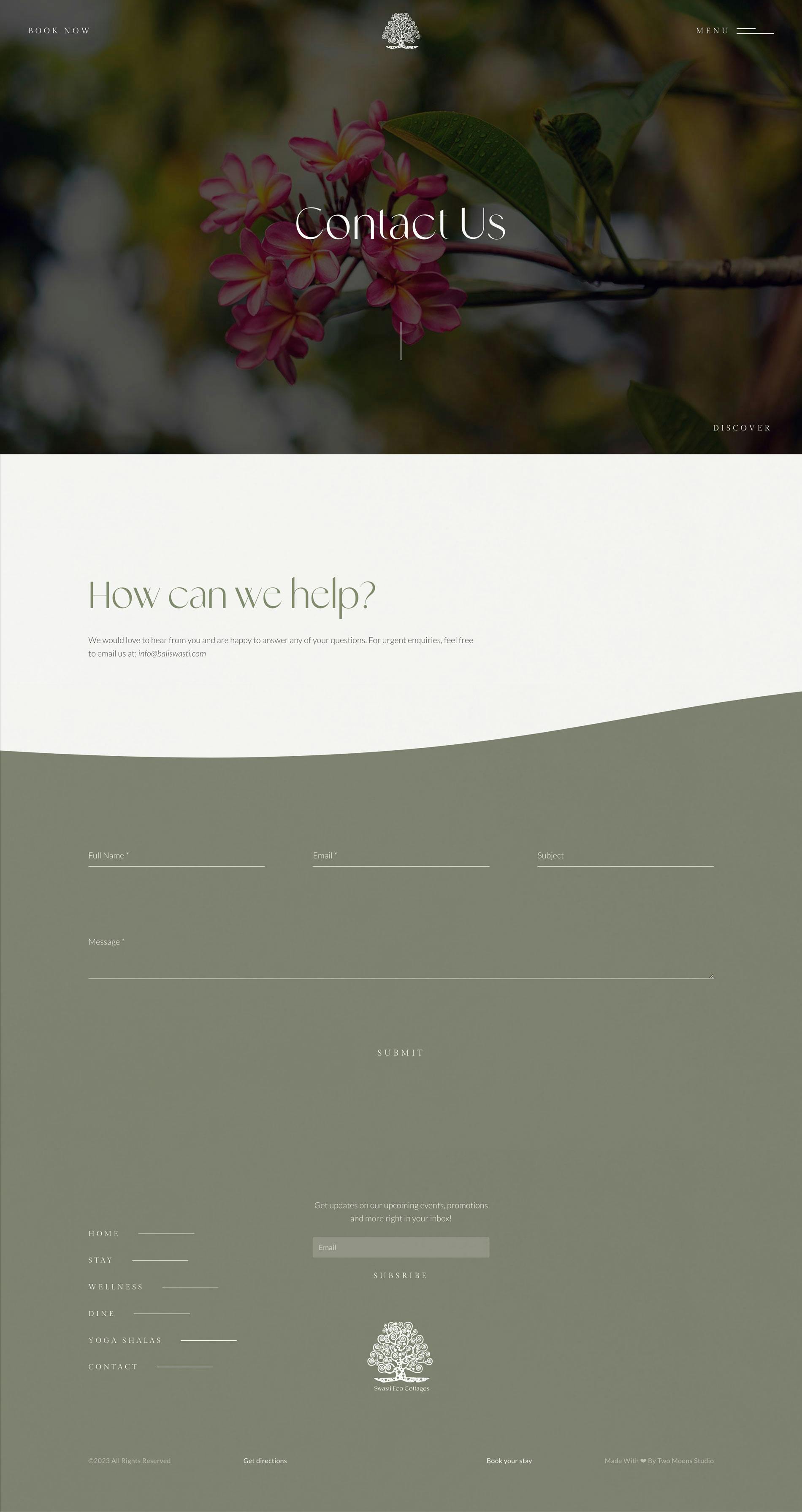
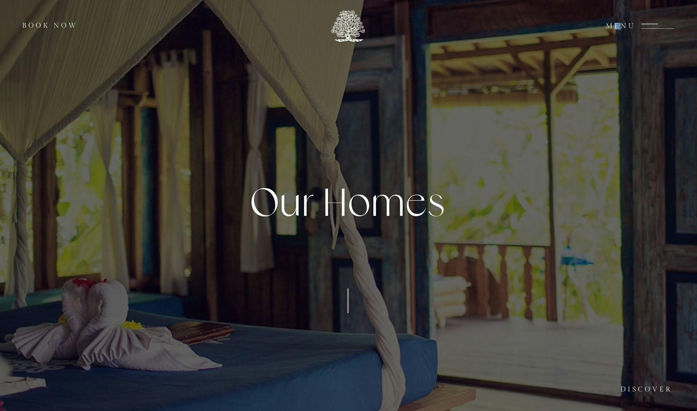
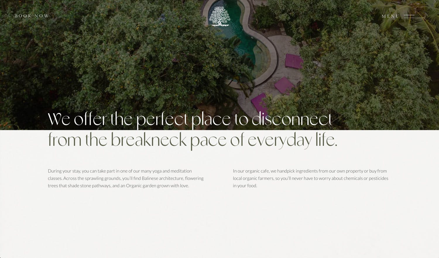
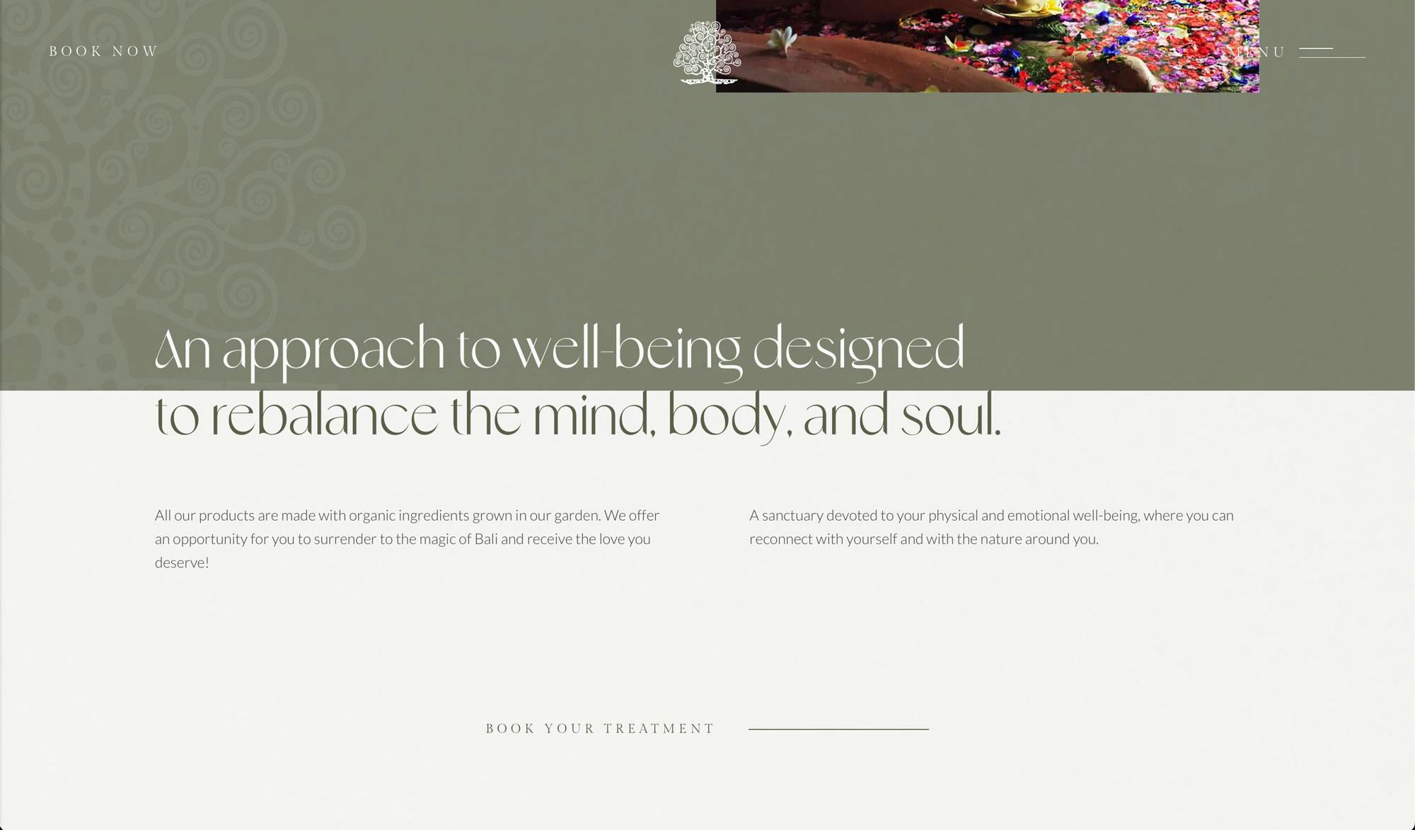
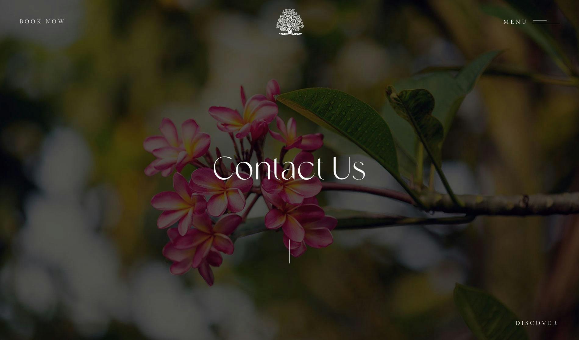
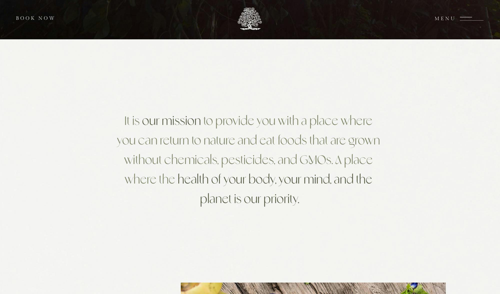
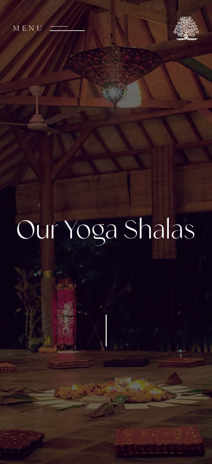
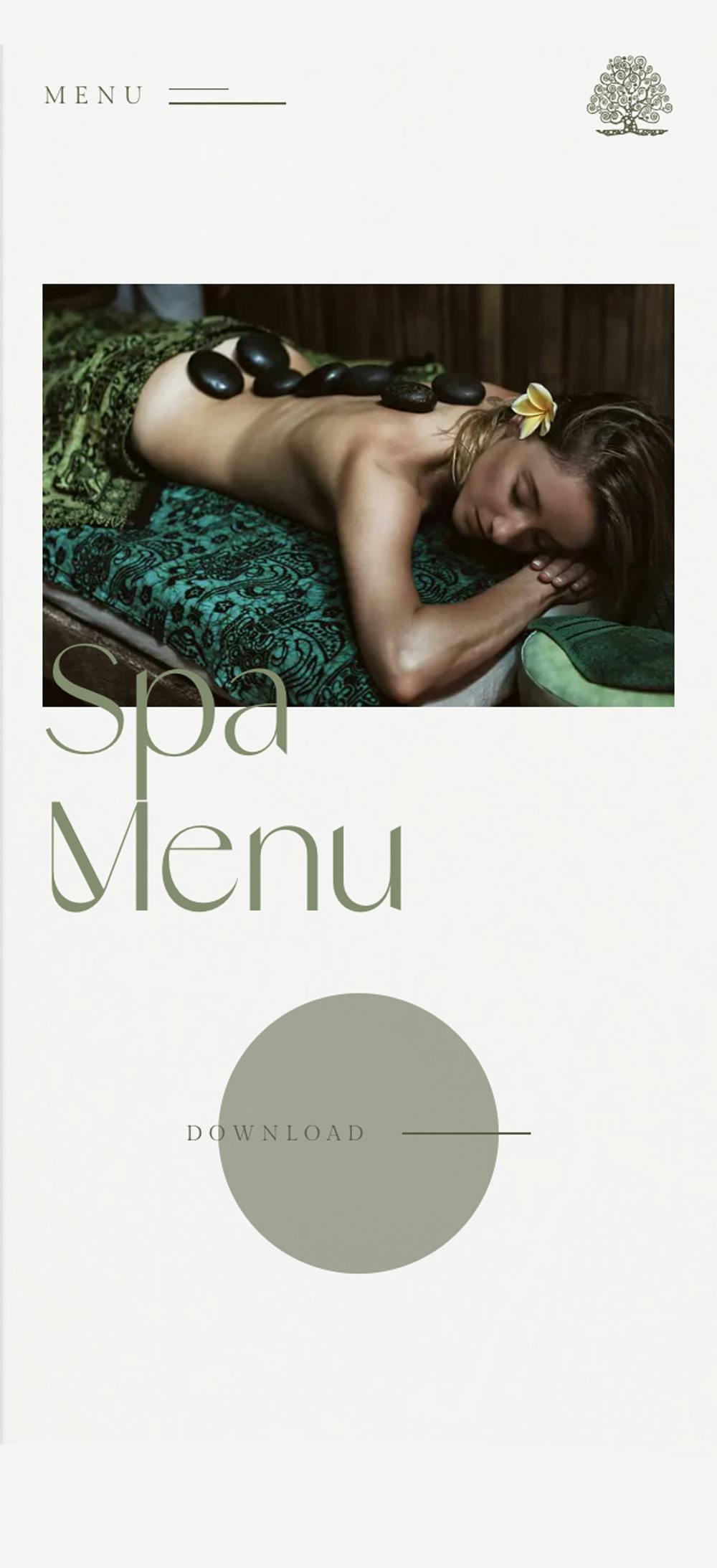
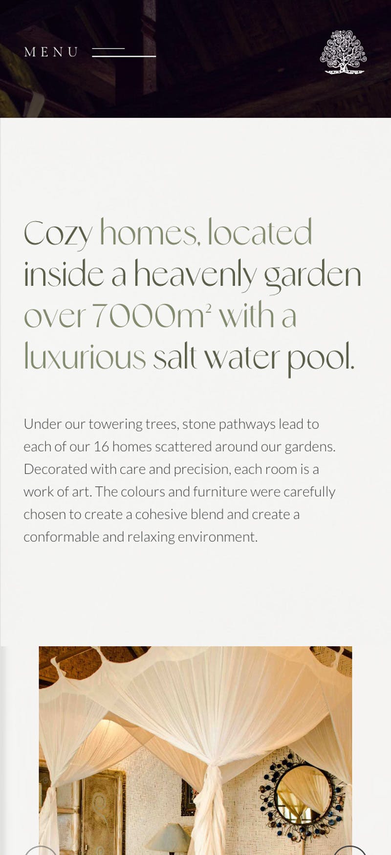
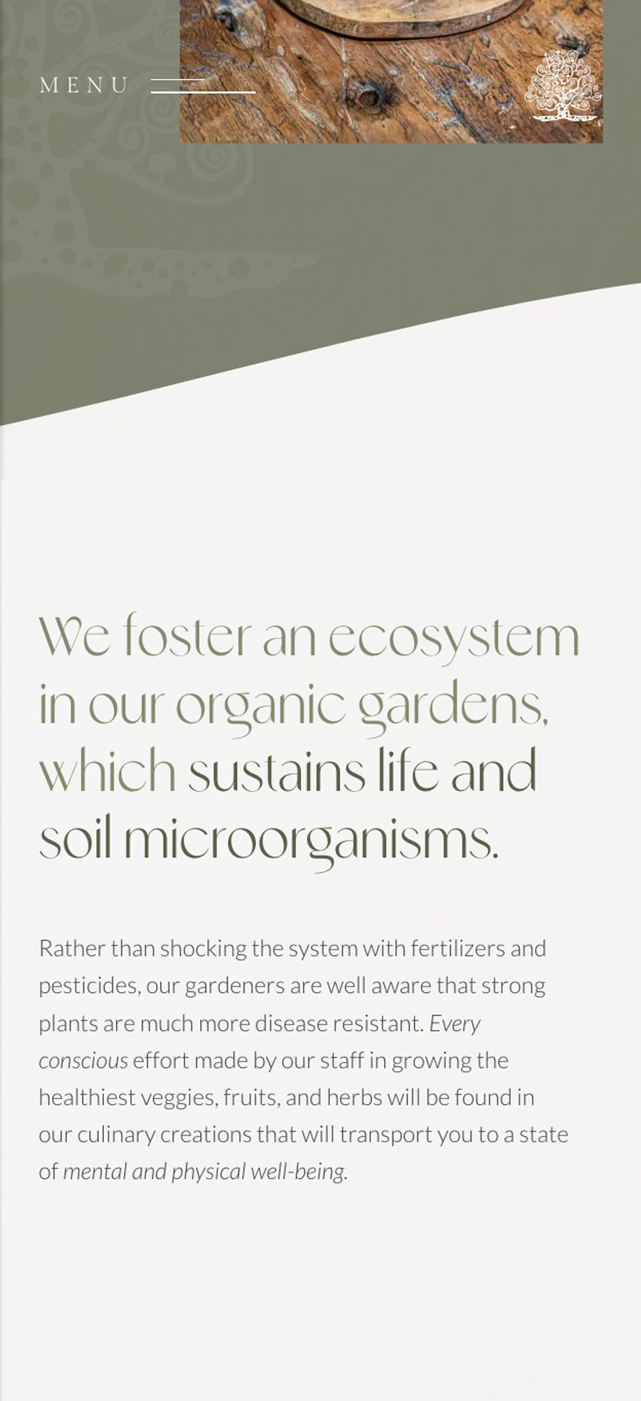
They needed a team that could bring their vision to life—a modern, minimalistic, and user-friendly website that would not only showcase the beauty of the resort but also guide visitors to book their stay. Our aim was to create a seamless customer journey from the moment visitors landed on the site to the point of booking. This was achieved through the strategic use of visual elements like photos, videos, animations, and micro-interactions. The site's artistic typography, fluid-structure, curved backgrounds, and natural, pastel colors were all chosen to capture the essence of the resort itself—elegant, warm, and artistic.
Animations
With a website in desperate need of a refresh, they came to us, feeling disheartened by its outdated and unpolished look.
By harnessing the dynamic capabilities of transitions and animations, we've artfully crafted a website that not only captivates the eye with its aesthetics but also guarantees an enjoyable and user-friendly navigation experience. To enhance user engagement further, we added some smooth text entrance animations. These animations serve as a visual guide, directing visitors' attention toward important content and making their journey through the site effortlessly intuitive.
Pages
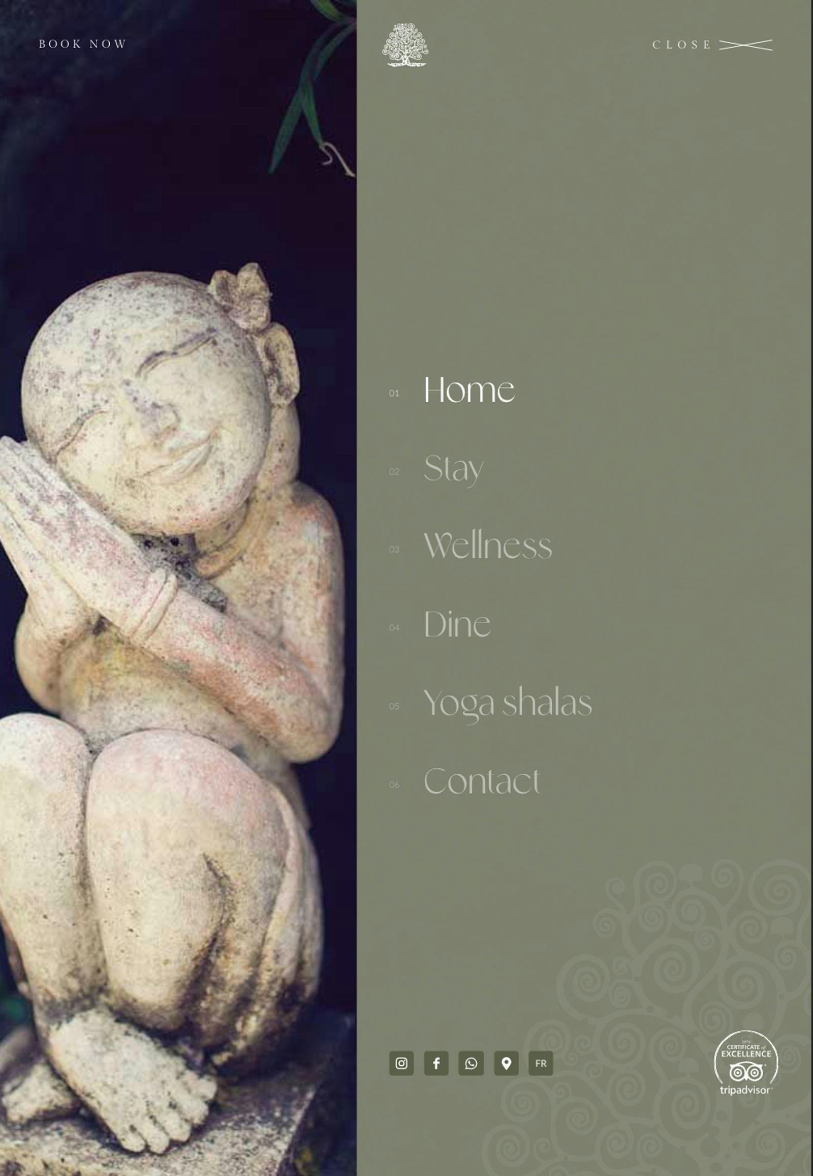
Across the website, you’ll find a consistent style on every page, where cohesive elements seamlessly integrate into the site’s design.
This cohesive approach creates a sense of unity, constructing a closely-knit collection of pages that work together harmoniously to elevate the overall browsing experience.
Testimonial
Their dedication to excellence truly showed through in the final result which is beyond expectations.
We had such a great experience working with Two Moons Studio. The passion, creativity, and professionalism demonstrated by the team are perfectly reflected in the unique and beautiful website we have today, a true representation of our eco resort. The revision process was smooth and effortless. They really demonstrated great attentiveness, actively listened to our ideas, and feedback, and offered very helpful professional insights when necessary. We are so grateful and happy, and could not recommend them more.
Drop in Bounce Rate
20%
Performance Score
+52%
Increase in Direct Bookings
20%

Translations
With a website in desperate need of a refresh, they came to us, feeling disheartened by its outdated and unpolished look.
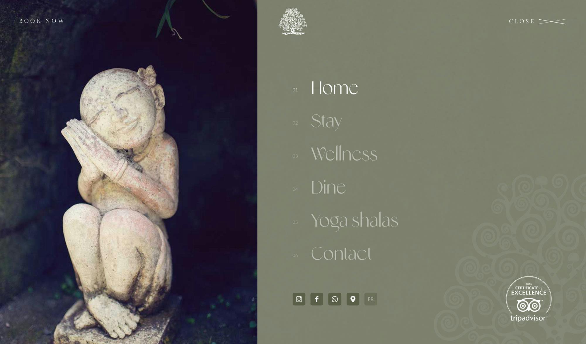
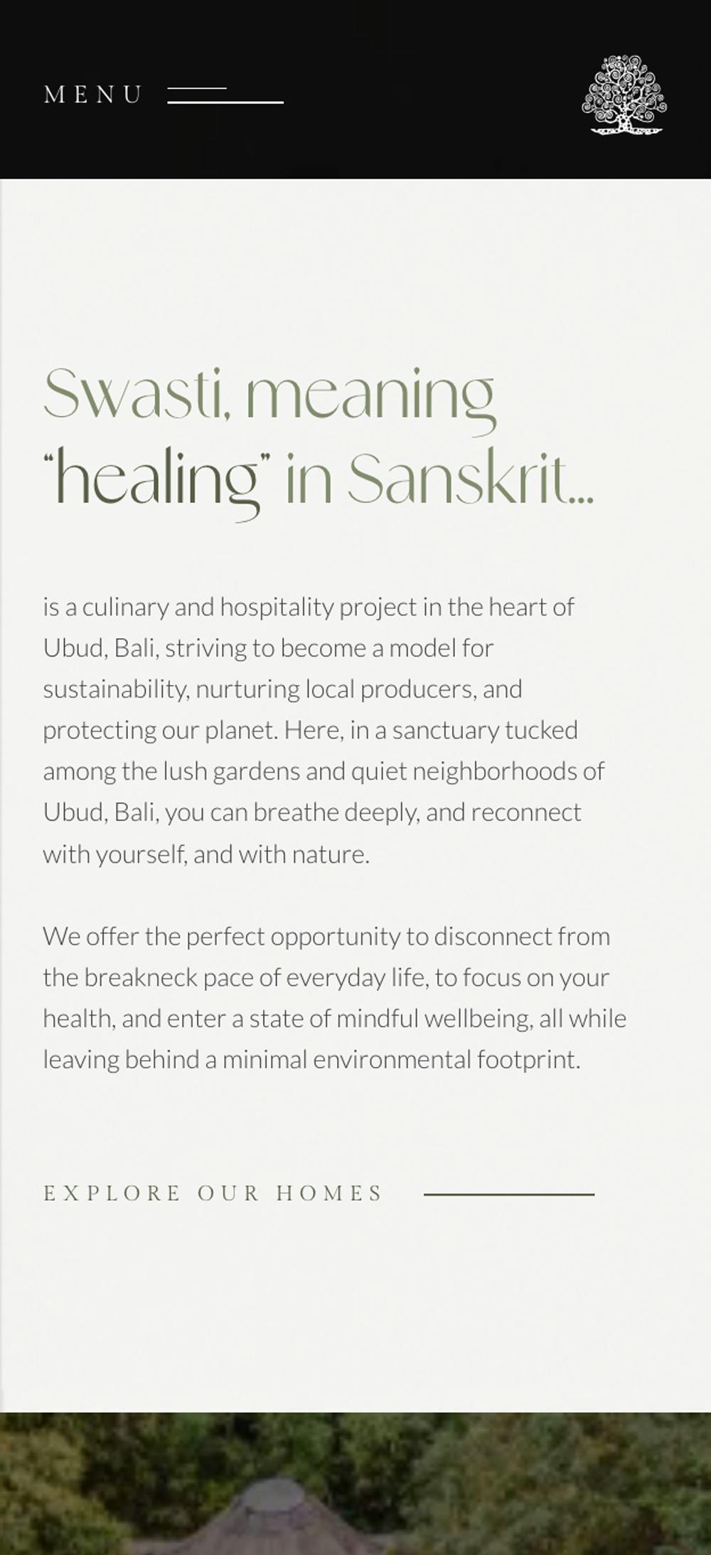
With the founder's French background and a global clientele, their goal was to create a bilingual website in both English and French. This choice was driven by the aim to reach a broader audience and offer easy access to information for French speakers. We designed a user-friendly system that made switching between languages as simple as turning a page, ensuring an intuitive experience for all visitors.
We are so grateful and happy, and could not recommend them more.
