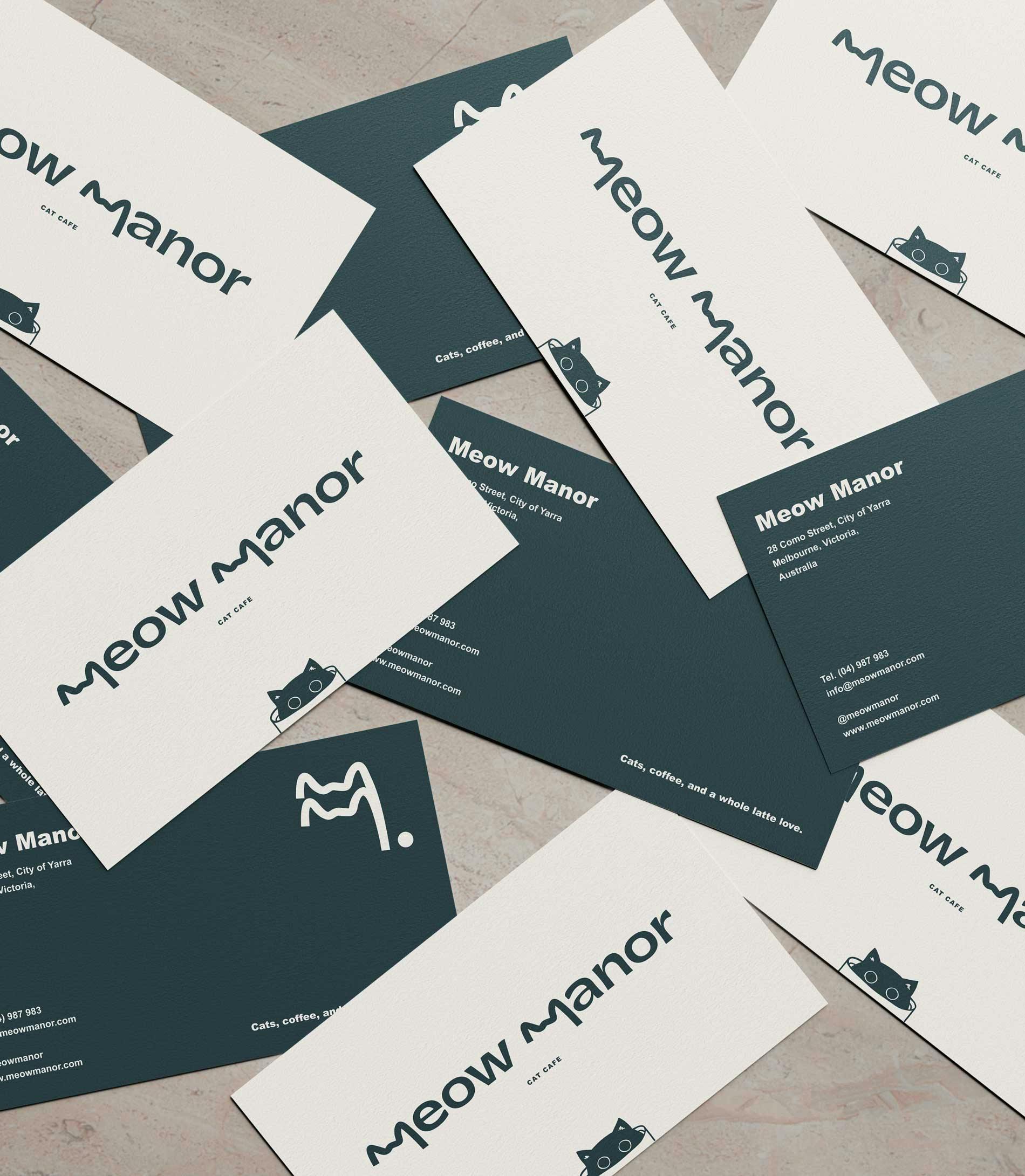
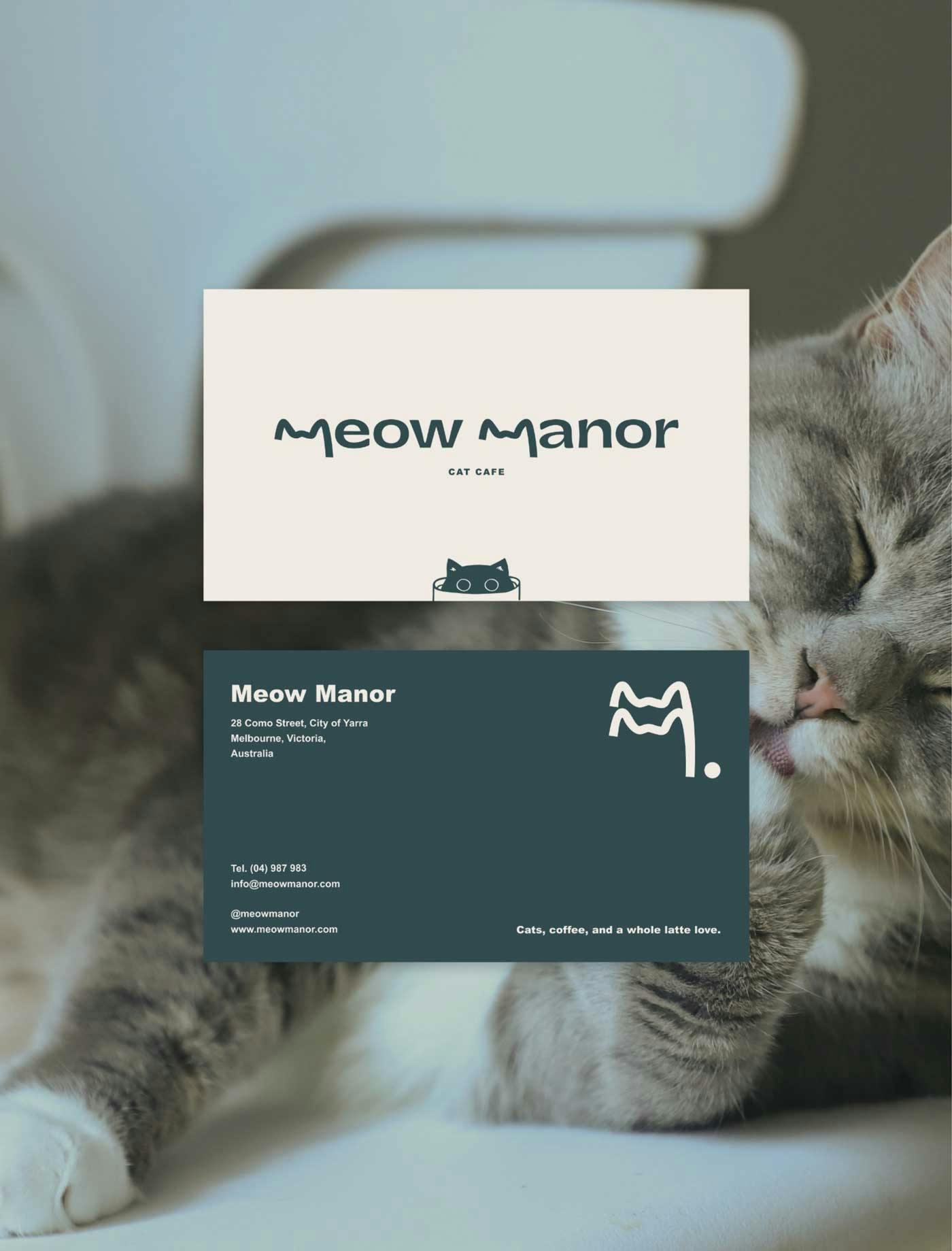
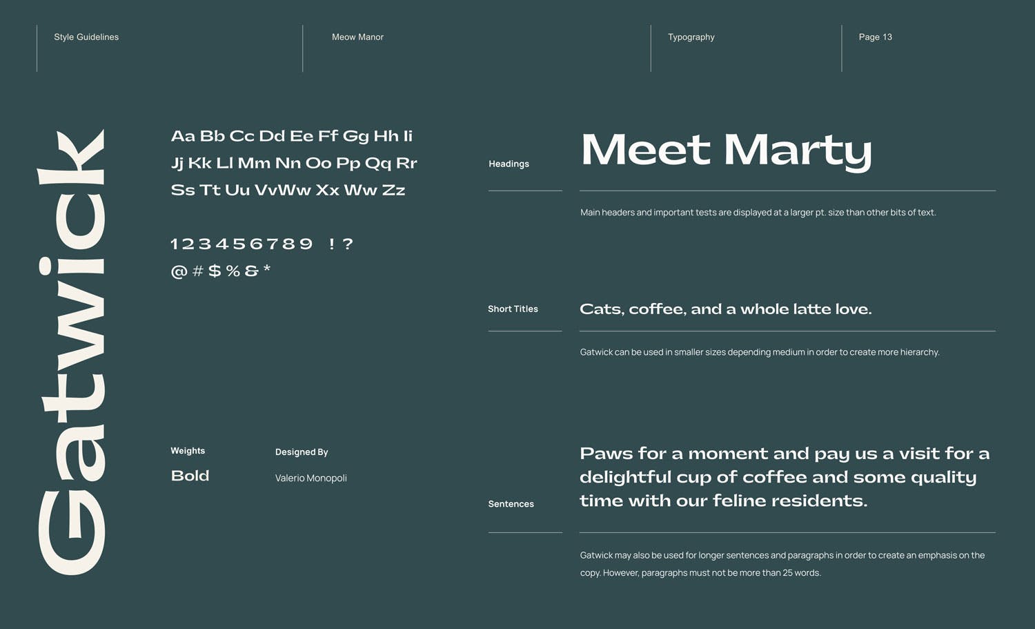
• poster mockup
  • logo mockup
  • brand icon
  • loyalty card mockup
  • business card mockup
  • poster mockup
  • logo mockup
  • brand icon
  • loyalty card mockup
  • business card mockup

Meow Manor

Crafting a modern, charming, and playful brand identity.

  • Brand Design
  • Collaterals
  • Tone of Voice
  • Tagline

Located in the heart of South Yarra, Melbourne, Meow Manor seamlessly blends modern design with cozy comfort. Visitors can indulge in freshly brewed coffee and delicious treats while enjoying the company of the feline companions. The inviting atmosphere, filled with the soothing hum of contented cats and friendly conversations, provides a tranquil escape from city life. It's a haven for cat-aholics and coffee enthusiasts, where moments of pure joy and connection await.

guidelines
style guidelines
style guidelines
style guidelines
style guidelines
style guidelines
style guidelines
style guidelines

Brand Personality

Modern, Homey, Charming,
Welcoming

Slate

Foam

Color Palette

We chose a minimalistic color palette to harmonize with the brand's modern, charming, and welcoming character. By limiting it to just two clean colors, our aim was to evoke a sense of peace and tranquility, avoiding any potential overwhelm or distraction that too many colors might bring. The final color choices consist of a deep, yet gentle gray-blue to evoke calm and serenity, paired with a soft beige shade to infuse simplicity, warmth, and a modern touch.

business card

Typography

In choosing the typography, our aim was to establish a seamless connection between the colors and the type. We wanted something bold and modern, yet possessing a unique touch that resonates with the brand's personality. For the primary font, we went with a sans-serif typeface to emphasize the brand's modern feel. It's a distinctive type, giving the brand an elegant, modern vibe with a touch of playfulness. To complement it, we selected a basic font that doesn't overshadow the primary type and ensures easy readability for viewers engaging with the content.

Primary Font / Gat- wick

Gat- wick

Designed By

Valerio Monopoli

Designed In

2019

Gatwick In Use

Take a paws and come say hi, for a delightful cup of coffee and some quality time with our furry friends.

Secondary Font / Arial Black

Designed By

Robin Nicholas

Designed In

1982

Arial Black

Weights

  • regular
  • black
Arial Black In Use

Located at the heart of South Yarra, Melbourne, we provide the purr-fect sanctuary for you to unwind with a freshly brewed cup of coffee and indulge in a delectable snack, all while enjoying the delightful company of our charming feline friends, each with their own unique and lovable personalities. We assure you, you're bound to find a furry friend you'll adore!

Mockups

stamp mockup
Loyalty card design
posters mockup
coffee cup mockup
poster mockup

The Logo

The logo was designed to exude a modern, clean, and unique aesthetic, all the while retaining a playful and welcoming feel.

Logo design

As a nod to the feline companions, we playfully shaped the "m's" into cat ears, creating the illusion of the top of a cat's head.

Brand mark

Tagline

The purr-fect escape.

illustrations

Mockups

paper mockup
business cards
stickers
cat posters
social media feed
coffee cup

Tone of Voice

Playful

Through our 'whisker'-sharp wordplay and heartwarming sentiments, we aim to create a space of genuine delight. Each interaction is an opportunity to connect, leaving a lasting impression of positivity and comfort.

Inviting

Our tone is like a warm, open invitation. It's akin to a friendly host welcoming guests into their home. It's approachable, kind, and makes you feel instantly comfortable.

Expressive

With words that paint vibrant pictures, we aim to whisk you away into a world of feline enchantment. Let our writing be your guide, inviting you to lose yourself in the delightful narrative of our cozy, whisker-filled haven.

brand logo
poster design
style guidelines
loyalty card
brand illustrations

Next Project

Setasa Marketing