Watching our brand come to life has been an unforgettable journey and the results speak for themselves.
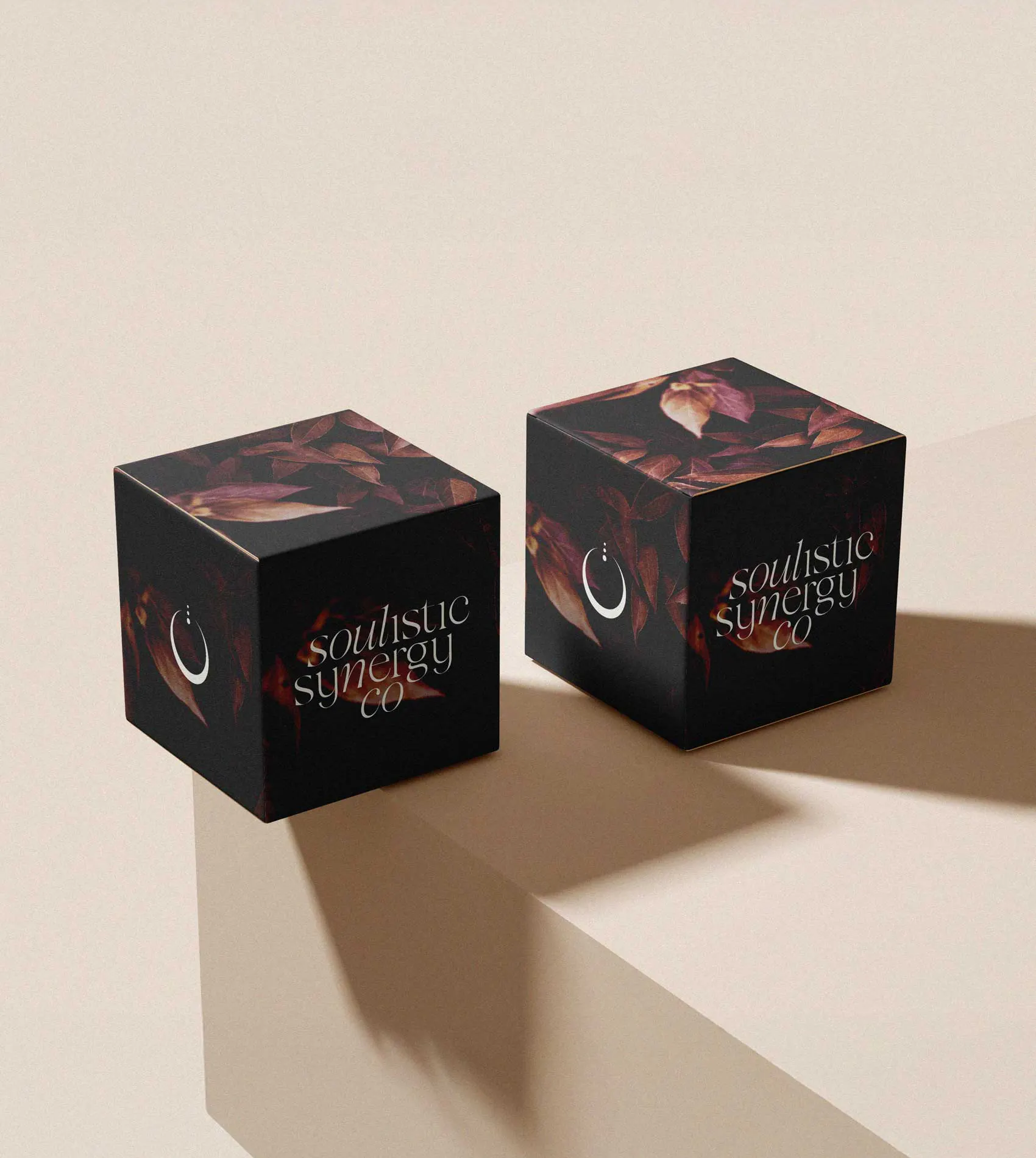
Soulistic Synergy Co
Inspiring individuals to take control of their health.
- Logo + Brand Design
- eBook Design
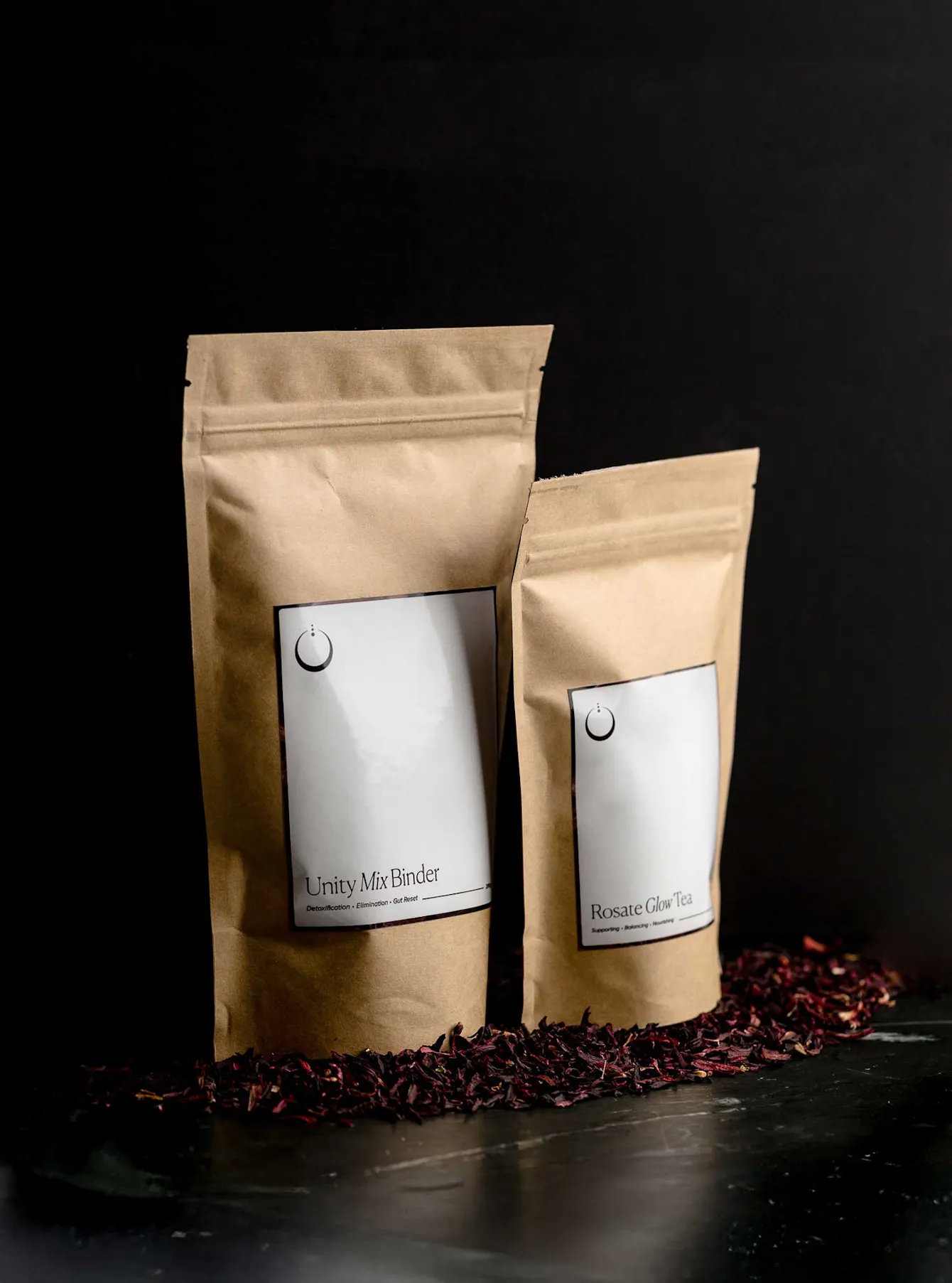
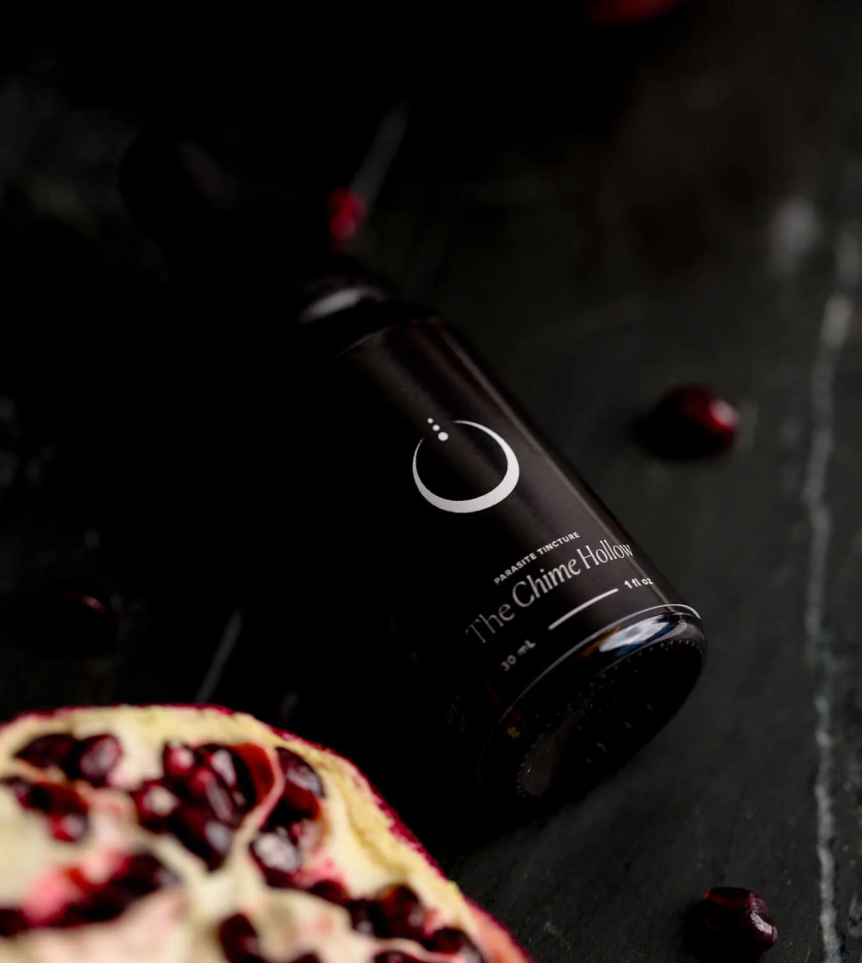
- Packaging Labels
- CLIENT Kali Sirett
- YEAR July 2025
- LOCATIONPerth, Australia
- PUBLICATIONSBrand of The Day (Braaands)
- TOOLSAdobe Illustrator / Photoshop / Procreate
Based in Perth, Australia, Soulistic Synergy Co is a holistic wellness brand dedicated to helping individuals take control of their health and restore balance through intentional cleansing. With no fluff or quick fixes, they provide educational content and high-quality solutions that promote real, lasting healing for the mind, body, and spirit.


Project Brief
They came to us for a brand identity and website that would truly reflect their vision.
Their original Canva-made logo lacked the depth, personality, and elegance they had in mind. While their vision was clear, they needed a team to bring it to life—one that could craft a refined, powerful identity rooted in both authenticity and professionalism.

Testimonials
Their creativity, professionalism, and deep dedication exceeded every expectation we had.
Working with Two Moons Studio has been nothing short of incredible! From our very first meeting, we felt truly heard and understood, trusting that they could bring our vision to life. Lola has an extraordinary ability to tune into both the visual and emotional essence of a brand, giving us confidence and peace, knowing we were in the best hands. Watching our brand come to life has been an unforgettable journey and the results speak for themselves. We couldn’t recommend Two Moons Studio enough!
Plum
cmyk
C:0M:69Y:69K:86- R:36G:11B:11
Hexcode
#240B0B
Rise
cmyk
C:0M:13Y:36K:29- R:180G:157B:115
Hexcode
#B49D73
Dune
cmyk
C:0M:1Y:5K:8- R:234G:232B:223
Hexcode
#EAE8DF
Olive Sage
cmyk
C:0M:2Y:31K:68- R:81G:79B:56
Hexcode
#514F38
Color Palette
They had a clear sense of the colors they resonated with, and those they wanted to steer away from.
With that in mind, we created a palette that balances earthy warmth with refined luxury. Plum adds richness and depth, Rise evokes warmth and transformation, Olive Sage brings a grounding, natural calm, and Dune introduces a layer of understated elegance. The result is a seamless blend of polished sophistication and organic charm, grounded yet refined, raw yet professional.
Mission Statement
"Our mission is to guide you on this transformative journey of renewal and self-discovery through a revitalizing process of cleansing."
eBook Design & Copy
Typography
Our goal with typography was to bring their vision to life in a way that captured their audience.
The result is a balance of timeless elegance and modern clarity. Canela’s refined contrast and fluid curves lend sophistication and readability, making it the focal point for headings, titles, and select subtitles. Complementing it, Proxima Nova adds a clean, approachable feel to body copy and subtitles, enhancing readability with a contemporary touch. Together, they form a distinctive and cohesive visual language.
Primary Font / Canela
Canela
Designed By
Miguel Reyes
Designed In
2016
Canela In Use
Our mission is to empower you to reclaim your health through effective, natural cleansing. We’re dedicated to providing high-quality solutions that restore balance to your mind, body, and spirit, guiding you towards lasting wellbeing and renewal.
Secondary Font / Proxima Nova
Designed By
Mark Simonson
Designed In
1994
Proxima Nova
Weights
- Regular
- Medium
Proxima Nova In Use
We understand that true wellness is about more than just surface-level fixes. At Soulistic Synergy Co we believe true healing begins by reconnecting with your body’s innate wisdom. It’s about listening deeply, honoring natural rhythms, and releasing what no longer serves your well-being.
We felt truly heard and understood, trusting that they could bring our vision to life.


The Logo
A balance of bold energy and grounded elegance, with fluid typography and subtle serif details that add sophistication.
The slight tilt in “soul” draws focus to the brand’s belief in cleansing not just the body, but also the mind and soul, clearing energy and releasing clutter for a sense of renewal.

Brand Mark

Designed to reflect balance, transformation, and inner wisdom, this minimalist yet symbolic brand mark carries deep meaning.
The open circle, evoking a crescent moon, reflects cycles of renewal and intuitive growth, while the three dots above suggest ascension and clarity, linking back to the three core elements of Soulistic Synergy Co—mind, body, and spirit.
Tone of Voice
Professional but not Clinical
We offer expertise with a thoughtful, approachable take on wellness. Our style is informed and grounded, yet never too technical or formal, ensuring we connect in a way that feels personal and inviting.
Subtly Informative
We share knowledge in a simple, easygoing way —informing without overwhelming. The focus is on making learning feel natural and effortless, helping you absorb key information at your own pace.
Simple and Clear
We keep things straightforward and to the point, choosing words that matter. Every message is crafted to be clear and purposeful, without unnecessary fluff, just meaningful, impactful communication.
Warm and Authentic
We speak with a genuine, welcoming tone, offering a sense of calm and reassurance. Our approach is warm and empathetic, making customers feel truly supported and understood every step of the way.