

Tacos Aqui
A bold, colorful digital experience.
- Web Redesign
- Development
- CLIENT Yasmin Bohn
- YEAR April 2026
- LOCATIONBali, Indonesia
- CMSPrismic CMS
- TECHVue JS / Nuxt / GSAP / NX by Nrwl / Lenis
- TOOLSIllustrator / Figma / Photoshop
Tacos Aqui began as a small neighborhood taqueria in Umalas, created as a welcoming place for locals and travelers to gather over tacos and margaritas. With its relaxed atmosphere and flavorful menu, it built a loyal following, leading to the opening of a second, larger location in Uluwatu. Today, Tacos Aqui continues to grow as a go-to spot for casual dining, known for its vibrant personality, delicious menu, and easygoing social atmosphere.
Project Brief
Tacos Aqui came to us wanting something new. Something better. Something bold.
Their old site was holding them back: no personality, and nothing that reflected the vibrant world they'd built. No detailed functions page, no fiesta packages, no set menus, no deals or events, and a PDF standing in for a menu, pulling visitors out of the experience. We rebuilt everything from the ground up. From the visuals to the words on every page, everything was crafted to reflect the same energy of Tacos Aqui. As a last little final touch, the cursor has been turned into a custom chilly icon.
Testimonials
We're really happy with the website, it looks very professional and luxurious, and it's exactly what we were hoping for.
The whole process was smooth and organized from start to finish. It’s honestly hard to find a web studio in Bali who works this professionally, has a company setup, and provides proper contracts, so that gave us a lot of confidence working with Two Moons Studio. The team is super friendly, easy to communicate with, and full of great ideas that truly improved the final result. Responses were always fast, and everything was communicated clearly. Lola especially has great attention to detail and is very easy to collaborate with, which made the whole experience enjoyable. We’ll definitely keep working with them for future projects. Highly recommended!
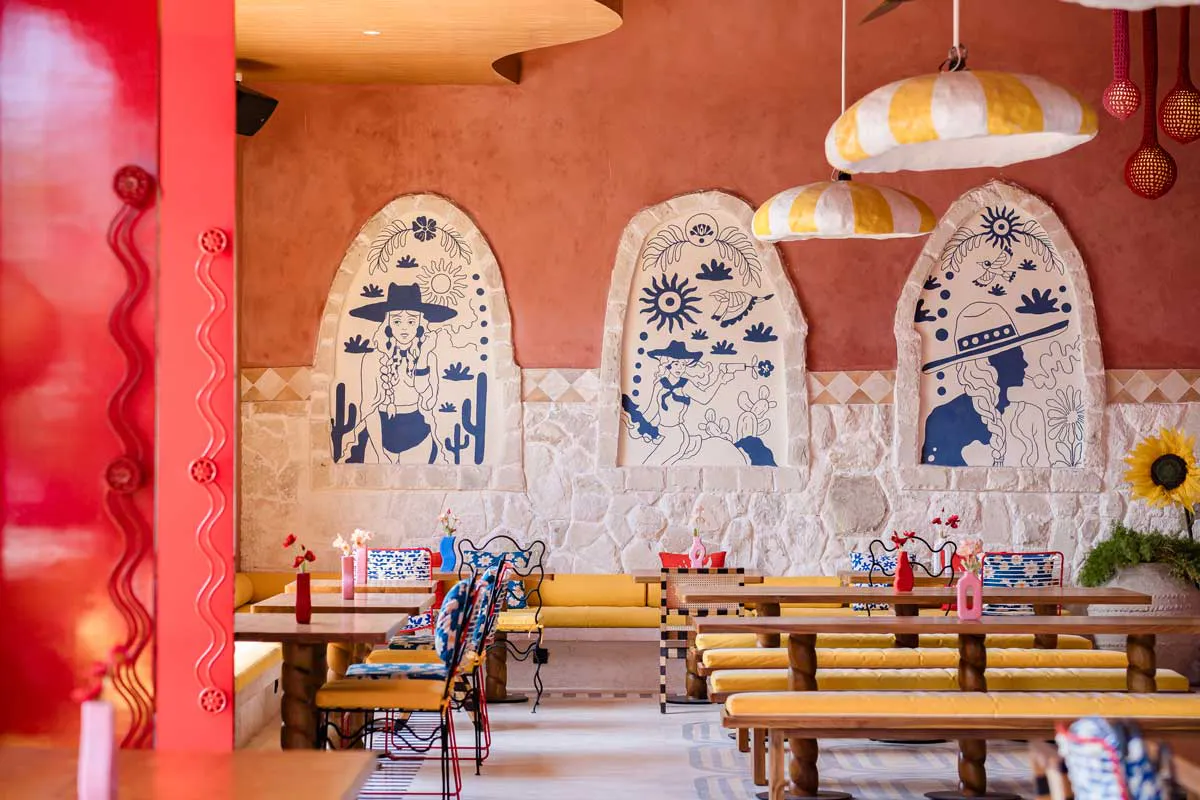
About Page
The faces and story behind Tacos Aqui, brought to life through fun, authentic visuals that capture who they really are.
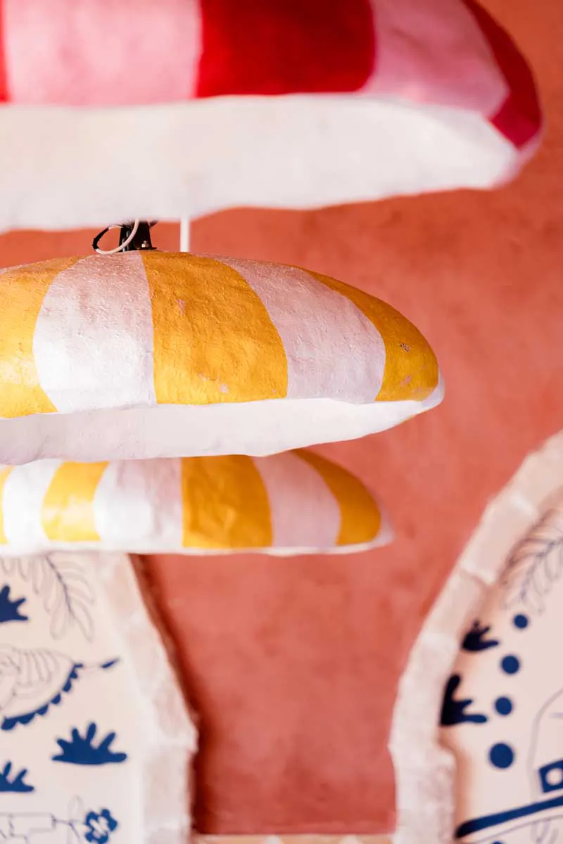
This page introduces the founders, offering a glimpse into how a small Umalas taqueria came to life. The tone stays playful and in line with the rest of the site, with bold layouts, vibrant imagery, and subtle movement keeping things engaging. A “Hot Seat” section adds a personal touch, spotlighting the team and owners in a raw, unfiltered way that brings warmth and personality into the mix.
Hot Seat (Our favorite Section)
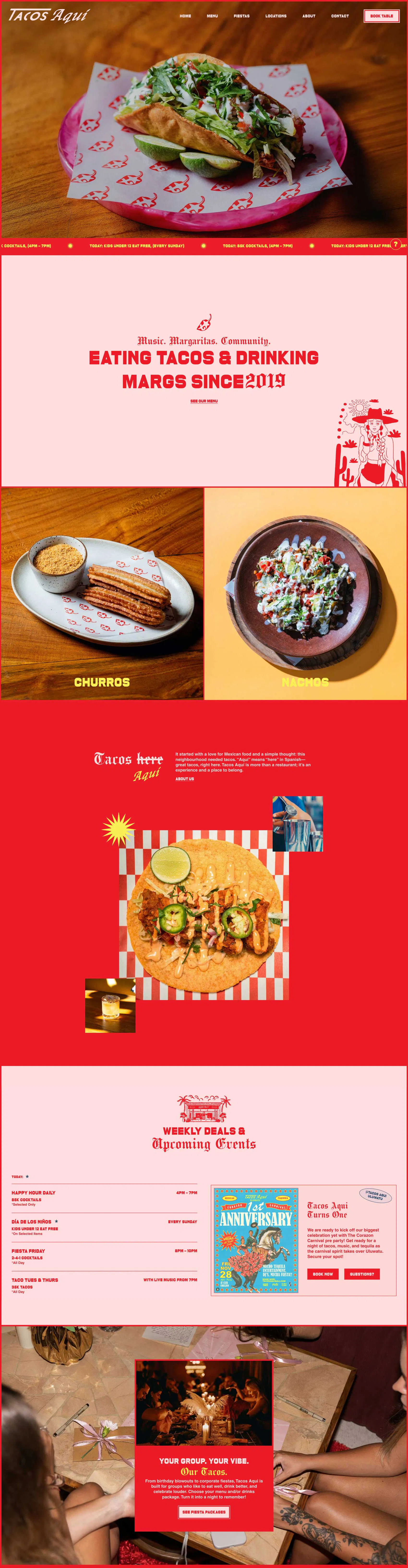
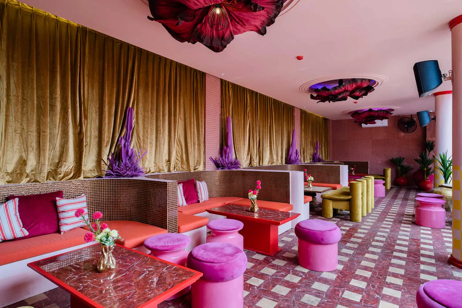
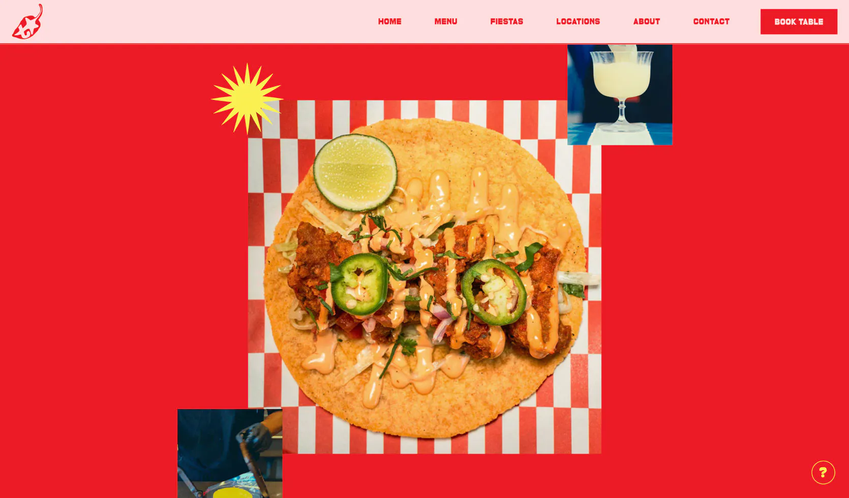
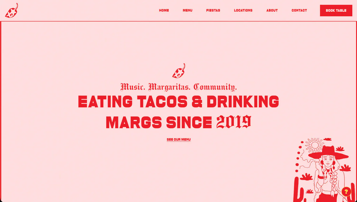
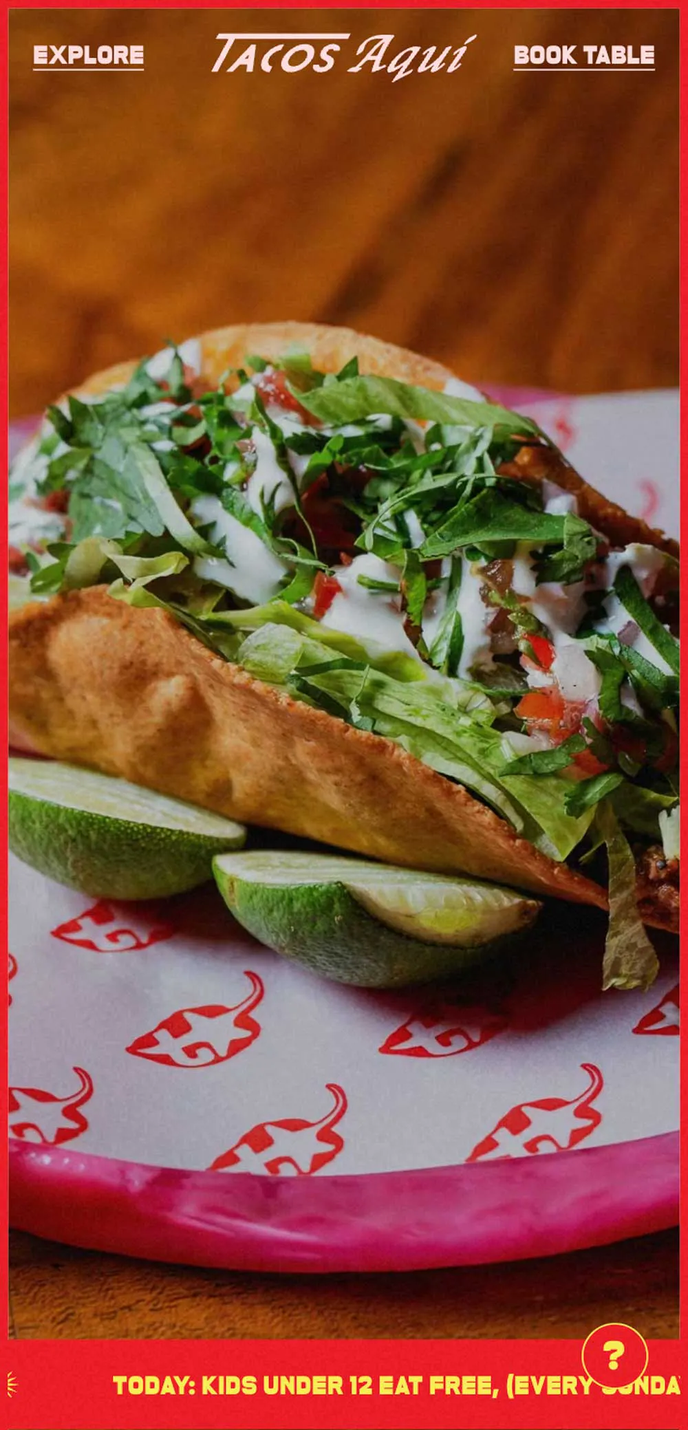
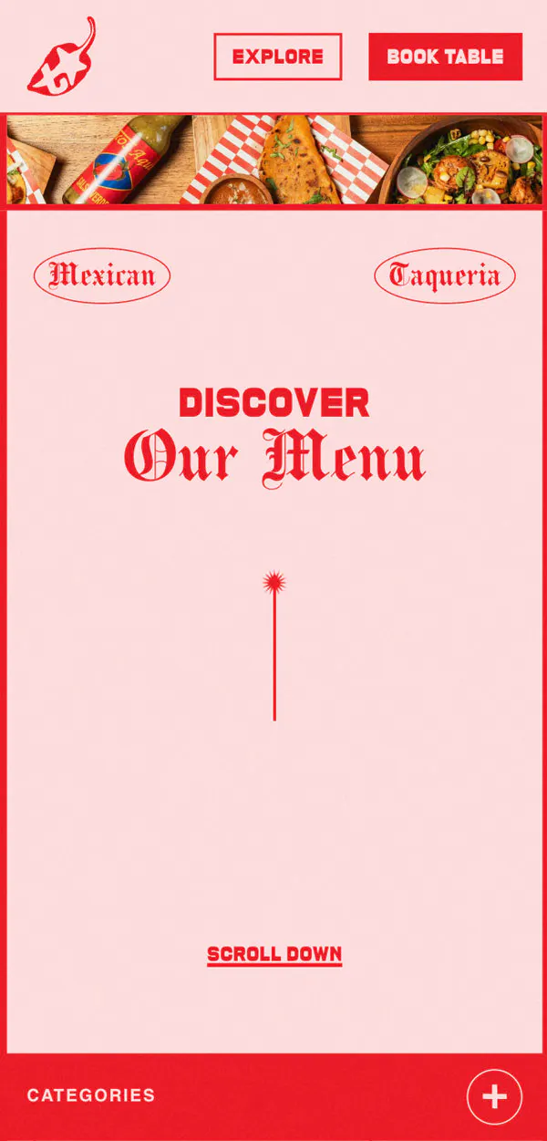
The Homepage
A bold first impression that instantly captures attention, with playful visuals and dynamic movement that reflect the energy of the brand and invite users to dive in.
From the first scroll, the homepage pulls you straight into the world of Tacos Aqui, bold colors, fun typography, videos, and movement all hitting at once. It feels fast, playful, and strategically chaotic in a way that mirrors the energy of the space itself.
Sections flow more like a visual collage than a traditional layout, mixing food, moments, and atmosphere rather than separating them. Everything sits front and center, giving a quick, immersive sense of what Tacos Aqui is about without needing to over-explain.
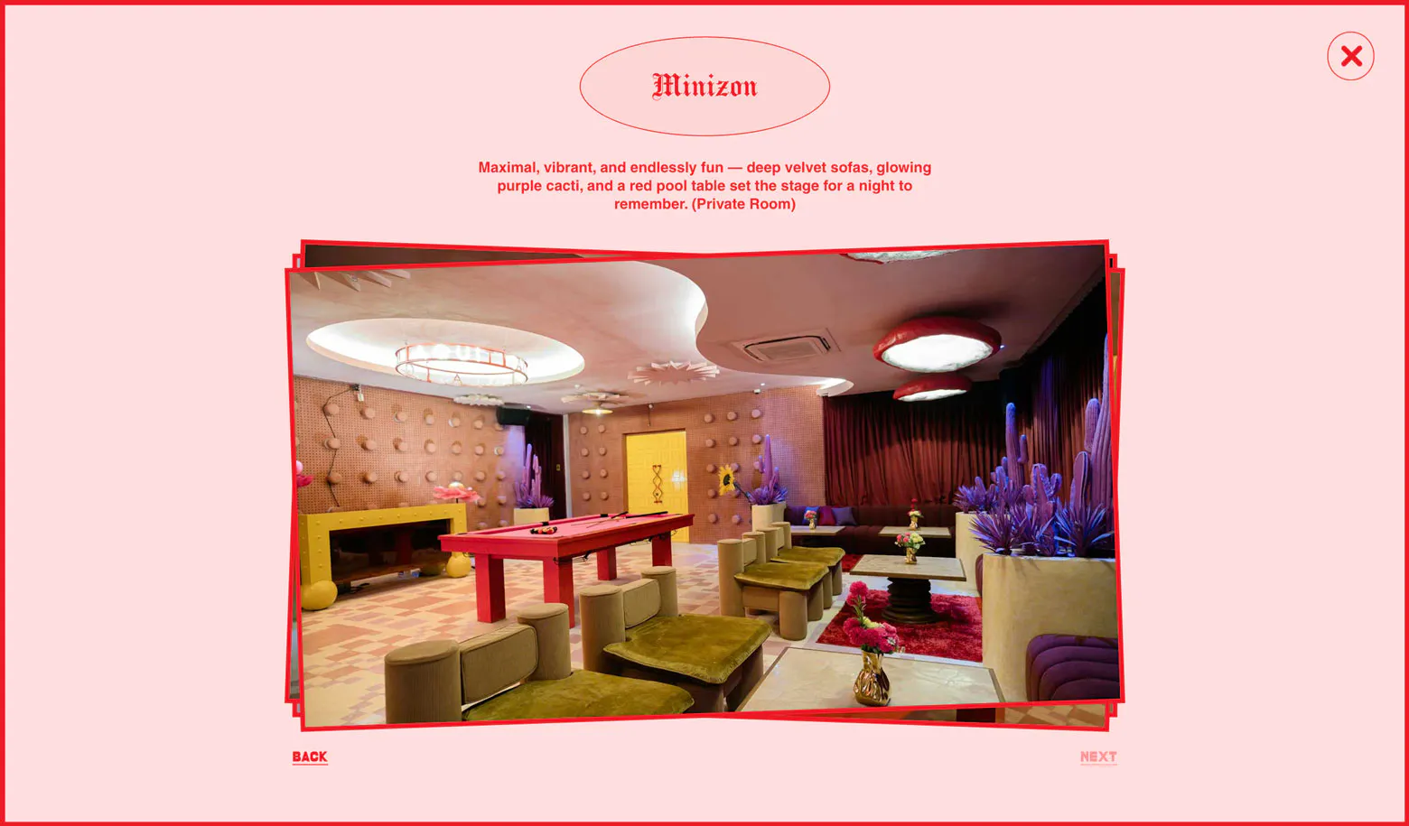
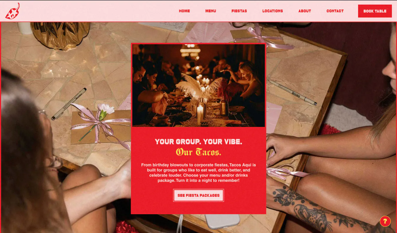
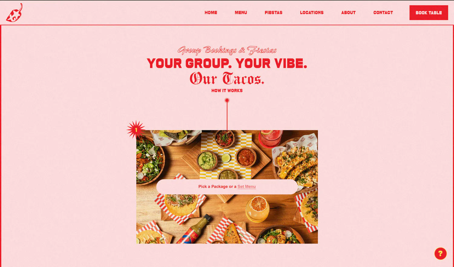
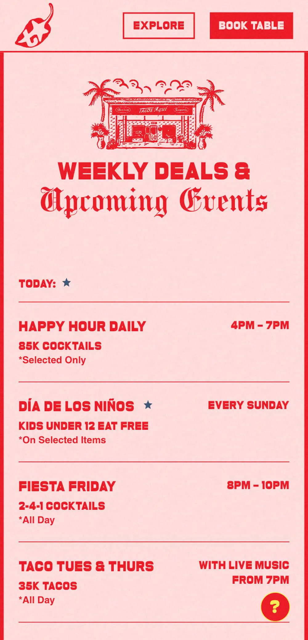
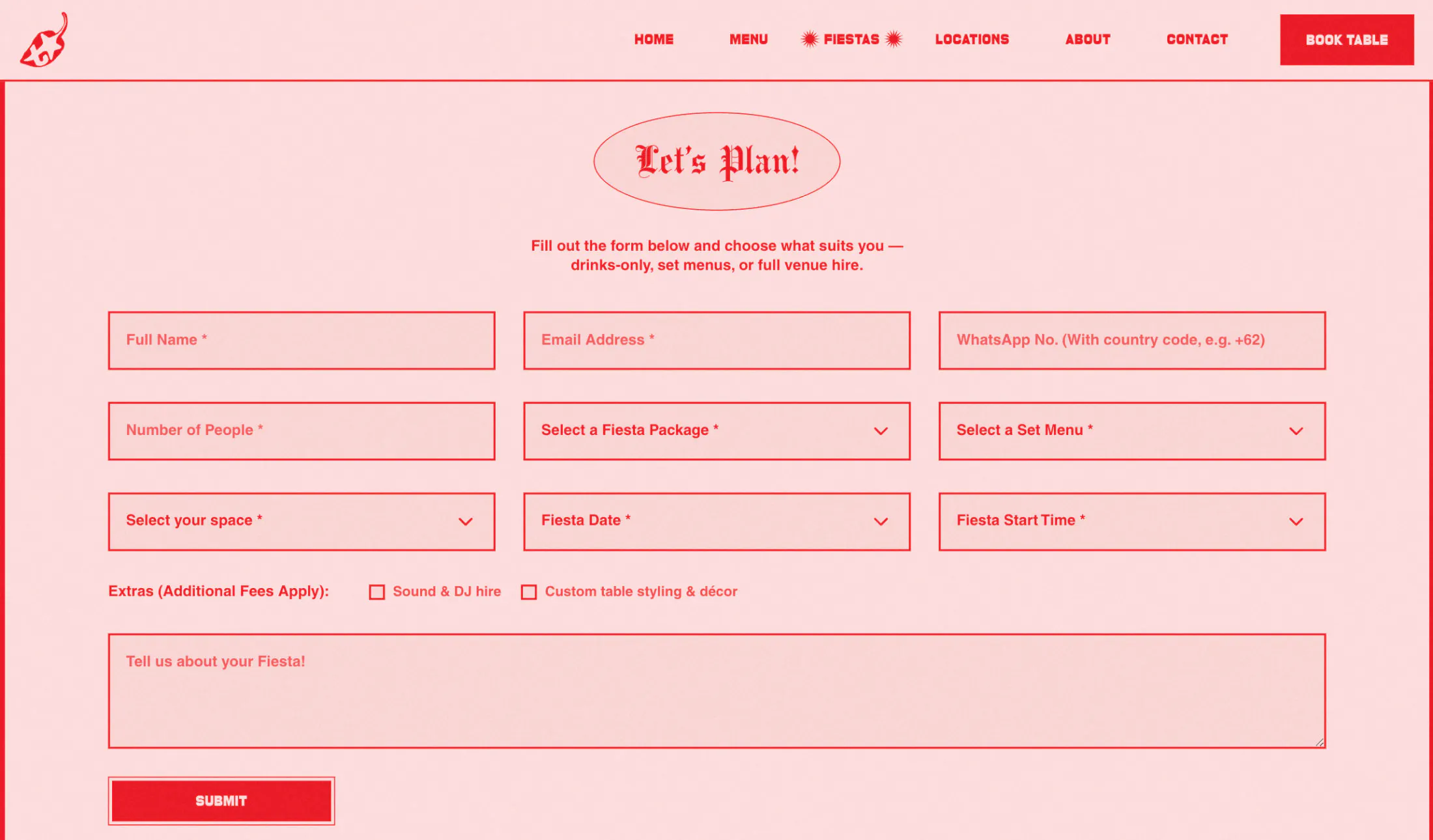
Functions Page
The Functions page was designed to make event planning feel effortless, exciting, and full of possibilities.
Visitors can easily explore the different package options, from intimate group dinners to larger celebrations, without ever feeling overwhelmed.Packages, spaces, and menu options are clearly presented, brought to life through vibrant visuals that reflect the spirit and atmosphere of Tacos Aqui. The page gently guides visitors toward making an inquiry, keeping the process effortless while still reflecting the fun, social energy of the brand.
Inquiry Form
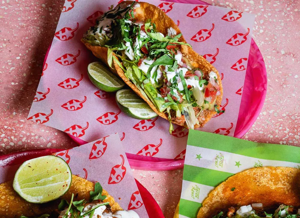
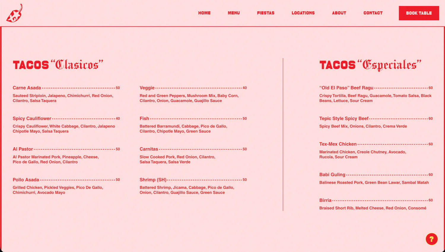
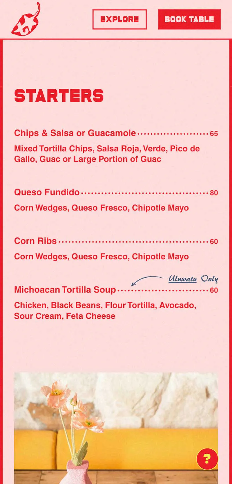
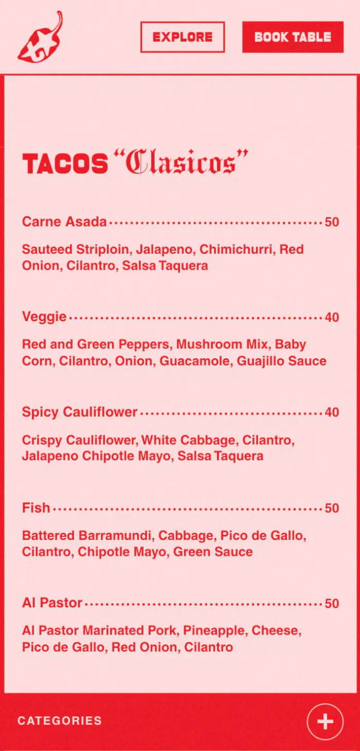
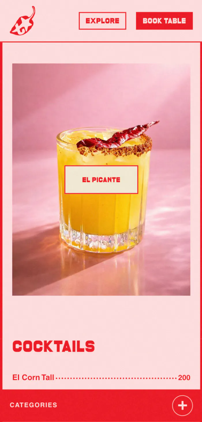
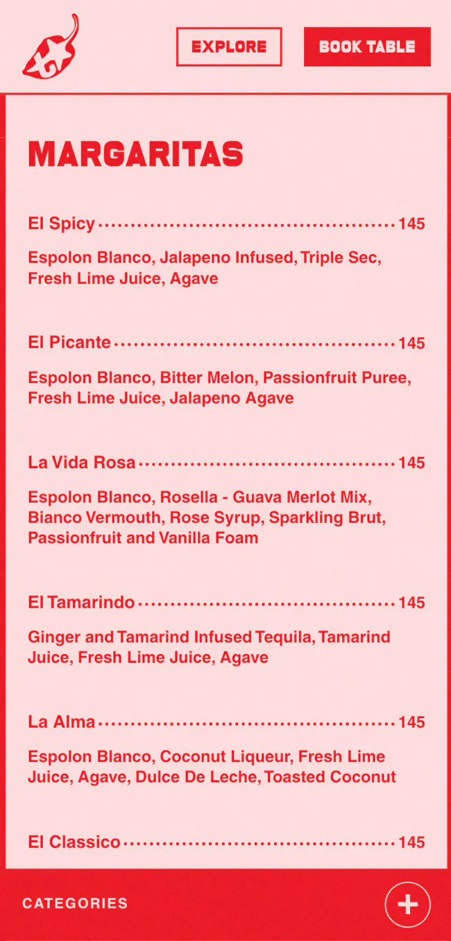
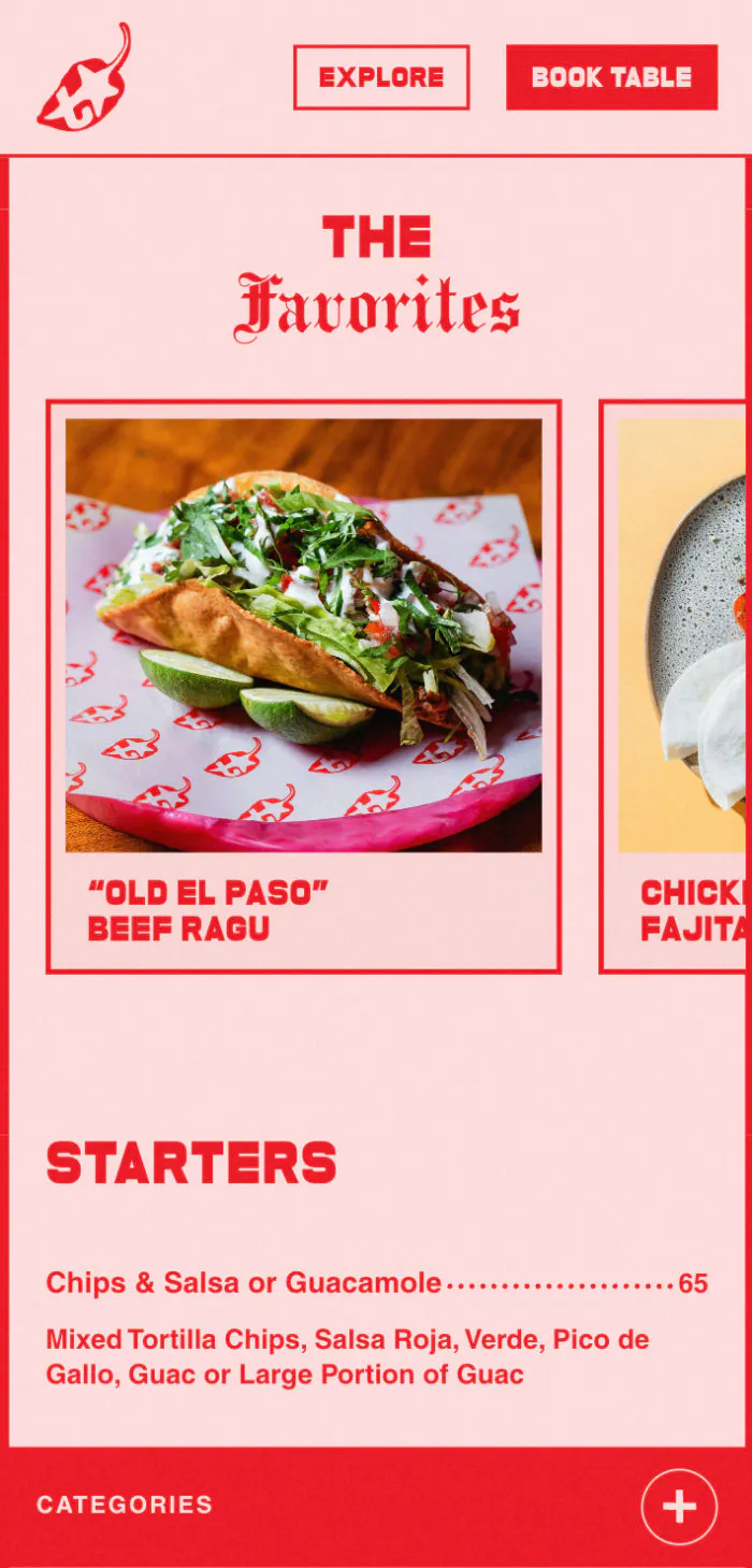
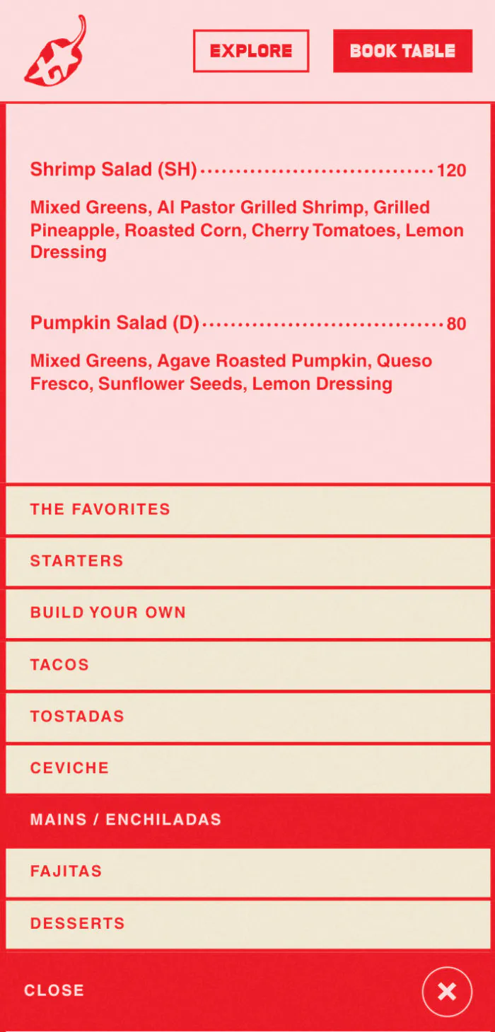
Menu Page
One of the main goals for the new site was to bring the menu directly online—no more PDFs pulling visitors away.
The old menu sent visitors to a separate PDF, creating friction and pulling them out of the experience at exactly the moment they were most engaged. On the new site, everything is right there on the page. Guests can explore everything from tacos clásicos and tacos especiales, to fajitas, and margaritas, fully immersed in the Tacos Aqui world. Playful illustrated stickers animate on load as a nod to the brand's fun spirit, and visitors can filter by location for a more tailored experience.
Locations
The previous page missed the mark. A busy background made the text hard to read, while the booking buttons simply reloaded the page instead of leading anywhere.
With two restaurants across Bali, this page was designed with one goal; help visitors quickly find what they need while capturing the unique feel of each space. A small map orients guests across the island, and each location gets its own pop up with all the key information and quick access to bookings and directions. A playful detail shows whether a location is opening or closing soon, adding a small but engaging touch that keeps the experience both informative and alive.
The team is super friendly, easy to communicate with, and full of great ideas that truly improved the final result.